
DIGESTIBLE DATA
TO BECOME CARBON NEUTRAL


A refreshed data-driven platform for Kotoo Earth that helped define the branding direction and image for the new web-based application.
THE CLIENT:
Kotoo Earth
THE ROLE:
UX Designer on a team of 4
THE TIMELINE:
4 Weeks
THE TOOLS:
Sketch, Figma, Invision, Miro, Notion, GSuite
THE
PROBLEM

Kotoo Earth; A newly launched carbon footprint calculator, handed viable information over to its users on a cold platter.
The platform was loaded with data that left users overwhelmed and confused. The Welcome page had little information for users about what Kotoo was and the purpose of the product. The dashboard was uninspiring with graphical information that displayed no actionable and specific instructions for improving one's carbon footprint.
“The platform had no style or sense of fashion.
No-no… that wasn’t a question.”
THE OUTCOME
A more organized web -based application that kept the users in mind

A better brand direction featuring a clearer dashboard , a more engaging welcome page, and informational pages for users to dig into at their own convenience. Through research along with user testing insights; we provided our client with an updated and refreshed design that is the new Kotoo

THE DETAILS
THE
OBJECTIVE
Release a new iteration of the Kotoo dashboard that is branded, well designed visually, along with a pleasing user experience. This will mean the dashboard’s information and data is easy to understand and actionable.
The newly launched Kotoo platform is full of data and insights on the user's carbon footprint, but no clear purpose on how to use that information. The platform lacks branding and a clear concise tone and feel that aligns itself within the climate change and sustainability industry.
ORGINAL
SCREENS

This was the first version of the Welcome page we came across. Our client designed 3 iterations of this while we were working on his product.

This was the second version of the dashboard the client provided after our initial deep dive.

The original Kotoo dashboard that we recieved with our project brief. Our client was busy iterating while we were as well.
QUESTIONS:
How can we make the information more specific and actionable to the user?
How can we make the data more visually appealing to both of Kotoo’s user personas?
How can we make a more informative and engaging welcome page to showcase the web-based application?

THE
PROCESS
FROM RESEARCH TO STYLE TILES
Leveraging client meetings and research to develop individual design directions and data visualizations to test with potential users and subject matter experts.
After our Kickoff Meeting with our client, we as a team dove into additional exploratory research to help us better understand the industry that our client was in. We also looked into some competitors and aspirational brands to see what other organizations were doing well and how we could differentiate Kotoo.
From that research, each team member developed mood boards and style tiles that would be digital mockups for the tone and feel of the Kotoo platform. The mood board focused on the aesthetic and style, while the style tile provided typography, iconography, UI elements, and imagery that tell a complete story. Each designer tested our style tiles in our first round of desirability testing. Below are the mood boards and style tiles I created for Kotoo.
MOODBOARDS
& STYLE TILES


My first Moodboard and Style Tile was inspired by an art form called Low Poly. The larger images are pulled together using shapes such as triangles to paint a bigger picture. I wanted to use an image that had similar elements of the client’s original logo. I used blues and greens as a color base based on the research found from other clients in the space.
My second Moodboard and Style Tile was inspired after my research into a carbon molecule. The colors were always black, white, and red. The client reacted well to a black and white dashboard during our meeting activity, so I wanted to provide something similar with a clean, minimal aesthetic.


INSIGHTS


Users made notable observations during the first round of desirability testing:
-
Disliked use of mixed fonts
-
Preferred a sans serif font over the serif font.
-
-
Color did not test well
-
Red was often seen as too bold against the monochromatic background
-
Red is often portrayed as a negative indicator.
-
Blue and Green gradients were too dark
-
The color choice made the platform feel dated and for an older audience.
-
Users also commented that information and data on graphs and charts need to be
-
well represented
-
interpreted visually
-
Simply detailed
-
easy to glance through
-
digestible
-
visually pleasing with color contrast
DESIGN PRINCIPLES
Honest
Our design aims to evoke transparency and trust through factual information.
We want the users to feel protected and confident in the personal information they are providing and the accurate data results Kotoo is displaying.
With our research and first 2 client meetings fresh in our mind, we as a team developed 3 design principles that guided us throughout our project.
Empower
Our design aims to equip its users with glanceable data to be able to make a change in their personal lives to better the world around them.
We want the users not to feel constrained, but to feel confident in freely exploring and implementing the data provided by Kotoo with continuous education to make actionable changes in their community.
Data-Driven
Our design puts data first in a simple, comprehensive way so all users know what they are reading and how they can apply the data to their personal lives.
We want the display of Kotoo’s data to be clear and concise so users can feel that the information is not overwhelming and feel confident in the need for information and its use.
FROM STYLE
TILES TO
HIGH FIDELITY
After feedback from our users, we all moved forward with designing High Fidelity screens to test our individual directions and thoughts to make the platform more engaging and informative to its users. From there we would conduct a second round of desirability testing that would provide some additional insights from our users.
Below are shots from my initial round of designs and the key points I developed to try and tackle some of Kotoo’s users’ main pain points.
FIRST ROUND
OF HI FI SCREENS


Illustrations and Highlights on the Welcome Page
-
To continue to engage potential users I developed these “Did you know?" moments to call out unique information.
-
To delight the user on their journey I added illustrations inspired by the original logo
Actionable information and Insights
-
To maintain the data-driven aspect of the platform I provided graphical breakdowns of the info being displayed.
-
To allow honesty and transparency I highlighted supportive insights on the dashboard


Digestible and Meaningful Data
-
For better user comprehension I developed extended color coding and usage. on graphs and charts
-
To break up the amount of data visualizations being displayed (It was getting a lil graph heavy, no seriously) I transferred graphical visuals to infographics.


INSIGHTS
Coming back with the team to discuss our overall findings we realized that we each had major strengths and distinct weaknesses within our individual platform.
We needed to come up with something that would hit all the areas that we each strived for in our design, but we needed to come together on one design.
Our Major Discovery- No one hit the mark.

THE UPDATE
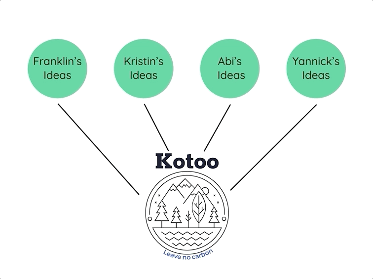
VERSION 2
After realizing what was best for our client, we went back and pulled apart all the elements of our individual designs and brought the best of the best to the table. Using Google Sheets to synthesize our data, it allowed us a birds-eye view of our work and what we needed to move forward. We found out what users responded to the most in each team members' design.
MY DESIGN:
KRISTIN'S DESIGN
ABI'S DESIGN
YANNICK'S DESIGN
-
Informational breakdowns and "Did you Know?" moments.
-
Use of color and illustrations used in the design.
-
Value Indicators and module spacing and layout on the dashboard.
-
The layout of Welcome page and dashboard.
UX FRAMEWORK
Taking these elements into consideration we also realized from user insights that the display of information was too long on a dashboard and often was overwhelming and discouraging to the user.
We needed to do some much-needed UX work
We heard some feedback regarding the platform being too much information to users on one page. We took some time to quickly do some UX rework of the platform and break up the dashboard to multiple sections.


THE
FINAL SCREENS

A BREATH OF CARBON-FREE AIR:
THE NEW
KOTOO
EARTH

THE SOLUTION
The team is very pleased with the final product and proud of the effort each member put in individually to create the new and improved welcome page, information pages, and dashboard for Kotoo Earth. Remember those questions we asked up above? Take a look at how we answered those questions within our converged design.
How can we make the information more specific and actionable to the user?
We developed “Snapshot Summary” modules on the “Your Results” and "Emissions Map" pages highlighting important information including a user’s current CO2e Footprint and the change from the previous month.


How can we make the data more visually appealing to both of Kotoo’s user personas?
We added in Icons and Imagery to sections of the dashboard including the “Emissions Categories” to better engage both user types. We also developed an extensive color system that provided color meaning and hue usage to sections and categories that matched back to the new brand
How can we make a more informative and engaging welcome page to showcase the web-based application?
Taking notes from other competitors, we added a hero image that fits into the tone and feel of the new brand and uploaded previews of the graphical information that would be on the dashboard. We added the illustrations that users responded well to in testing to complete the story.


Before our Final Handoff to our client, we had some loose ends that needed to be tied up
USER INSIGHTS
From the response on our final user testing sessions, our team really transformed the brand and made a more engaging, digestible product for the user. The user interface that was created for Kotoo fit into what users thought the brand should be based on color, photography, and illustrations.
Users did make note of opportunities that we could fix before our final handoff including font sizing, however major concerns such as information display were noted and submitted in a future recommendations document.
FINAL
THOUGHTS
DESIGN
SYSTEM
The "why?" behind the design

We documented all of our design decisions and guidelines in one deliverable. This design system complemented the new design direction and all of the elements that created the story of Kotoo. Check out the case study for more information regarding the Kotoo Design System
RECOMMENDATIONS
We really enjoyed learning so much about Kotoo and its unique approach to climate change. Some final user thoughts after our research to really help the brand.
-
Information hierarchy- Users really appreciated the work that our team did to create a more organized and less intimidating platform. Kotoo need to push that aspect further to make the display of information and its context more engaging and useful to its users
-
Color Exploration- We really provided Kotoo with a clear color story and theme for the branding as well as the data visualization. Some additional work can be done as the Kotoo platform expands and develops more to keep color classification as clean and concise as possible.
MY
REFLECTIONS
Teamwork makes the dream work!
I really enjoyed working on this project with this team. We had some major hurdles to overcome (learning Figma in 2 weeks was one), but we fought through and overcame it in the end. Our client was great to work with and made the experience that much easier
Ok, bye!